Our society spends a lot of time talking about democracy but rarely defines it. While the term comes from the Greek words “demos” (people) and “kratos” (power,) many political scientists have abandoned it due to widespread misuse and instead use the term “polyarchy”, which means ‘many rule.’ It was convincingly inserted into the academic lexicon by the the political scientist Robert Dahl in his 1971 book “Polyarchy.”

Dahl proposes that all political systems can be places on a graph with two axis: competitiveness and inclusiveness. Competitiveness asks: who can compete for political office. Inclusiveness asks: who can decide who wins the competition. We can apply the concept of polyarchy by asking these questions of different political systems: for example: the America and Israel.
America has a two-party system which makes it less competitive than Israel, which has dozens of political parties in parliament, enabling more people with more diverse perspectives to compete. This makes Israel a more “competitive” state than American. But, since Israel doesn’t allow Palestinians to vote, America is a more inclusive state.
Dahl’s definition of polyarchy is good, but it’s not complete. His theory doesn’t account for the most powerful force in politics: information distribution. Those who control access to information have tremendous political power because they can amplify certain elements within society and silence others.
Including “openness” (defined as transparency and accessibility) into the model improved it because it allows us to address the issue of information distribution. In a state with positive openness, information flows between government and society in an efficient manner that facilitates public participation in political processes. In a state with negative transparency, misinformation flows between government and society, enabling a secretive ruling class to exploit the general public.
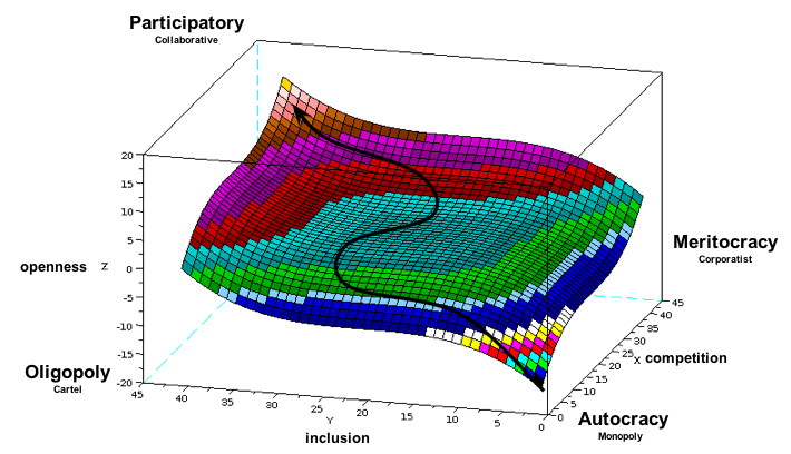
By adding openness to Dalh’s polyarchy graph as the third dimension, one naturally wonders what the relationship between competitiveness and inclusiveness could be. Can we graph this relationship? After looking at dozens of possibilities, z=x^3 + y^3 looks compelling. In this graph, a positively transparent society appears in the top left area of the plane while a negatively transparent society appears in the bottom right area one.

Let’s see what this relationship reveals:
- A society that is inclusive but not competitive has a negative openness. This makes sense because, in this scenario, a lot of people are supporting a poor selection of leaders, making the construction of false realities essential to convince people the situation is acceptable. Ex. the Soviet Union had a vast propaganda machine while the one-party political made competition virtually nonexistent.
- A society that is competitive but not inclusive is highly transparent. This makes sense because each individual who can vote has an unusually high influence on their political system, so it makes sense for them to invest time and resources in information that makes selecting good leadership easier. Ex. 19th century America had a very active, highly decentralized news and information distribution sector (newspapers) geared towards properties white men of voting age.
- A society that is both competitive and inclusive would be extremely open. This makes sense because so many citizens would have both the ability select from a diverse set of potential candidates, which would prompt the public to engage in mass participation in the political process. Ex. More open societies statistically have higher levels of voter turnout.)
We’re in the early stages of “participatory” politics as new tools (ex. OpenCongress) are enabling the public to increase transparency and accessibility of information to levels impossible before the advent of networked technologies. A tremendous increase in government transparency seems to be imminent. We could watch this happen in real time if we turned our 3D graph into a 4D animation, allowing us to track different societies paths towards more participatory political processes over time.
We need a common, quantitative understanding of political imperative so our governments can create purposeful foreign policies that encourage competitiveness, inclusiveness and openness. A simple way for national governments to advance a foreign policy based on quantitative principle would be to raise tariffs with closed nations and lower tariffs with closed ones.
Leave a Reply