Over the last year, a number of clients have tasked me with bringing datasets from many different sources together. It seems many people and groups want to work more closely with their peers to not only share and merge data resources, but to also work with them to arrive at a “shared data model” that they can all use to manage data in compatible ways going forward.
Since spreadsheets are, by far, the most popular data collection and management tool, using spreadsheets for this type of work is a no-brainer.
After doing this task a few times, I’ve gotten confident enough to document my process for taking a bunch of different spreadsheet data models and turning them in a single shared one.
Here is the 10-step process:
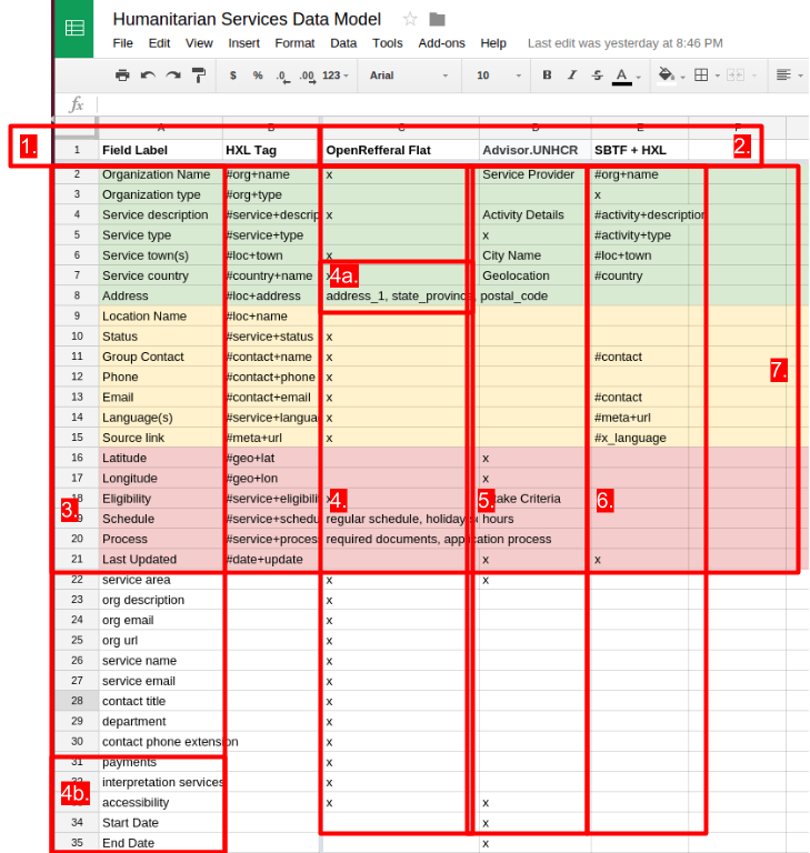
- Create a spreadsheet. First column is for field labels. You can add additional columns for other information you’d like to analyze about the field such as its data type, database name and/or reference taxonomies (i.e. HXL Tag).
- Place the names of the data models you’ve selected to analyze in the column headers to the right of the field labels.
- List all the fields of the longest data model on the left side of the sheet under the “Field Label” heading.
- Place an “x” in the cells of the data model that contain the field to indicate it contains all the fields documented in the left hand column.

This is a sheet comparing three different data models with a set of field labels and a “taxonomy convention”. - Working left to right, place an “x” to indicate when a data model has a field label contained therein. If the data model has that field but uses a different label, place that label in the cell(4a). If it doesn’t have that field, leave the cell blank. Add any additional fields not in the first data model to the bottom of the Field Labels column (4b).
Do the same thing for the next data models.- Once you have all the data models documented in this way, then you can look and see what the most popular fields are by seeing which have the most “x”s. Drag those rows to the top, so the most popular fields are on the top, and the least popular fields are on the bottom. I like to color code them, so the most popular fields are one color (green), the moderately popular ones are another (yellow) and the least popular but still repeated fields are another (red).
- Once you have done all this, you should present it to your stakeholder community and ask them for feedback. Some good questions are: (a) If our data model were just the colored fields, would that be sufficient? Why or why not? What fields should we add or subtract? (b) Data model #1 uses label x for a field while data model #2 uses label y. What label should we use for this and why?

Give people a “template” they can use to actually manage their data. - Once people start engaging with these questions, layout the emerging data model in a new sheet, horizontally in the first row. Call this sheet a “draft template”. Bring the color coding with it to make it easier for people to recognize that the models are the same. As people give feedback, make the changes to the “template” sheet while leaving the “comparison” sheet as a reference. Encourage people to make their comment directly in the cell they’re referencing.
- Once all comments have been addresses and everyone is feeling good about the template sheet, announce that sheet is the “official proposal” of a shared data model/standard. Give people a deadline to make their comments and requests for changes. If no comments/changes are requested – congratulations: you have created a shared data model! Good luck getting people to use it. 😉
Do you find yourself creating shared data models? Do you have other processes for making them? Did you try out this process and have some feedback? Is this documentation clear? Tell me what you’re thinking in the comments below.

Leave a Reply